Welcome back to our new interior series, 4 Corners Of My Home. This week we spoke to Michelle, the lovely lady behind the popular account, @houseofmaram.
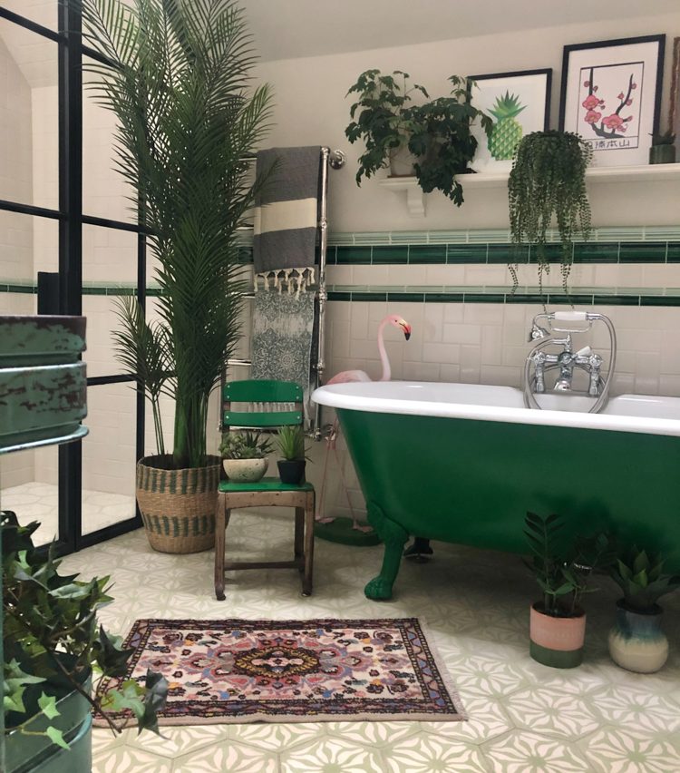
Corner 1, Family bathroom.
Green is such a fresh and enticing colour that works well in any room. We knew that we wanted a green bathtub and because of that, the tiles have hints of green without being over-powering. By adding a few vintage objects, like the chair, it helps to give the room more character. The steel shower screen is done in a crittal style (Fabco) and was custom-made to fit the space. The floor tiles are from Popham Design and the wall tiles from Fired Earth.

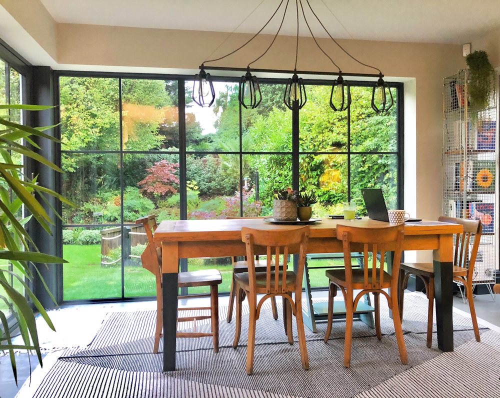
Corner 2, Kitchen/diner.
The aim here was to let in as much natural light as possible and find a way to enjoy the garden throughout the seasons. By installing floor to ceiling windows on three sides of the room, we’ve brought the outside in, so we love spending time in here. Overall, we’ve kept the furnishing and colours pared back in this room so that we can let nature be the focus. The windows are from Sapa and part of the Crown system, and we used a company in Sussex to source these. We found the dining chairs from a brocante market in France and the artisan light from Heals. The rug is from Laredoute.

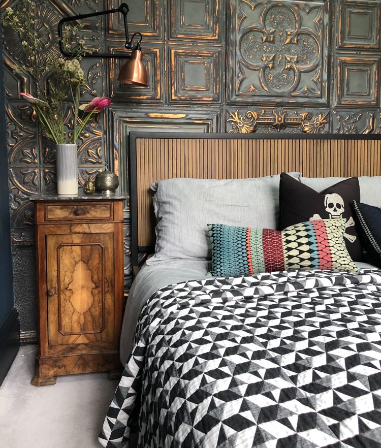
Corner 3, Master bedroom.
This room has a modern, industrial feel but still manages to be cosy. We pushed up into the rafters so it’s almost five metres to the ceiling, which has allowed us to create a lovely sense of space. To help divide the room, we built a free-standing wall behind the bed and added American tin tiles as a feature. By doing this, it creates more texture and intrigue to the space, as it’s more unusual than wallpaper. Behind the wall, we have a walk-in wardrobe and ensuite which also has a high ceiling. The bed has been positioned so that it looks out onto the garden and it’s wonderful to wake up to a wall of green. There is a mixture of modern and vintage furnishings in the room. We found the antique bedside tables on holiday in France one year and have added new fittings, such as the Flos lights.

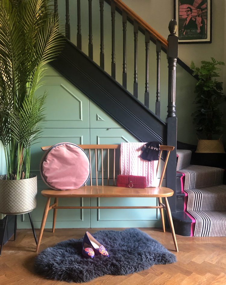
Corner 4, Hallway.
We wanted to ensure the entrance was a warm and welcoming space without any clutter. There used to be a powder room under the stairs but we changed that to a closet for coats and shoes. We also built big pull out drawers for extra storage and added simple but attractive panelling. The green wall of panelling and black stairs are painted Farrow and Ball colours. The stair runner is from Roger Oates and we’ve painted hot pink stripes either side for a bit of fun. When we renovated the house, we had the parquet floor installed and it’s something that I would recommend if you want to create a timeless look that doesn’t date. To keep the hallway stylish but sleek, we have an understated bench seat and a single pendant light from Original BTC.


