1. Living room
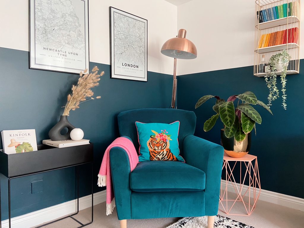
Previously our living room felt bare, cold and grey. It might have been practical for when the kids were little but it wasn’t exactly a space you would want to relax in at the end of the day! So we decided to be brave adding some colour, and it’s completely transformed the room. The armchair is precious to me as it used to be my dad’s favourite chair. I decided to keep it and have it reupholstered in teal velvet, as a little memory of him, and it fits perfectly at home in this corner. We painted the walls half height in Farrow and Ball Hague Blue as it’s my favourite colour, and I just love sitting here seeing how it changes colour in different lights. This corner also houses my growing collection of colourful Observer books which my husband hunted out for me in our local bookshops. We also have two prints of our two most loved cities from Mapiful, which cleverly takes any postcode to create beautiful art prints for your home.

2. The Rainbow Room
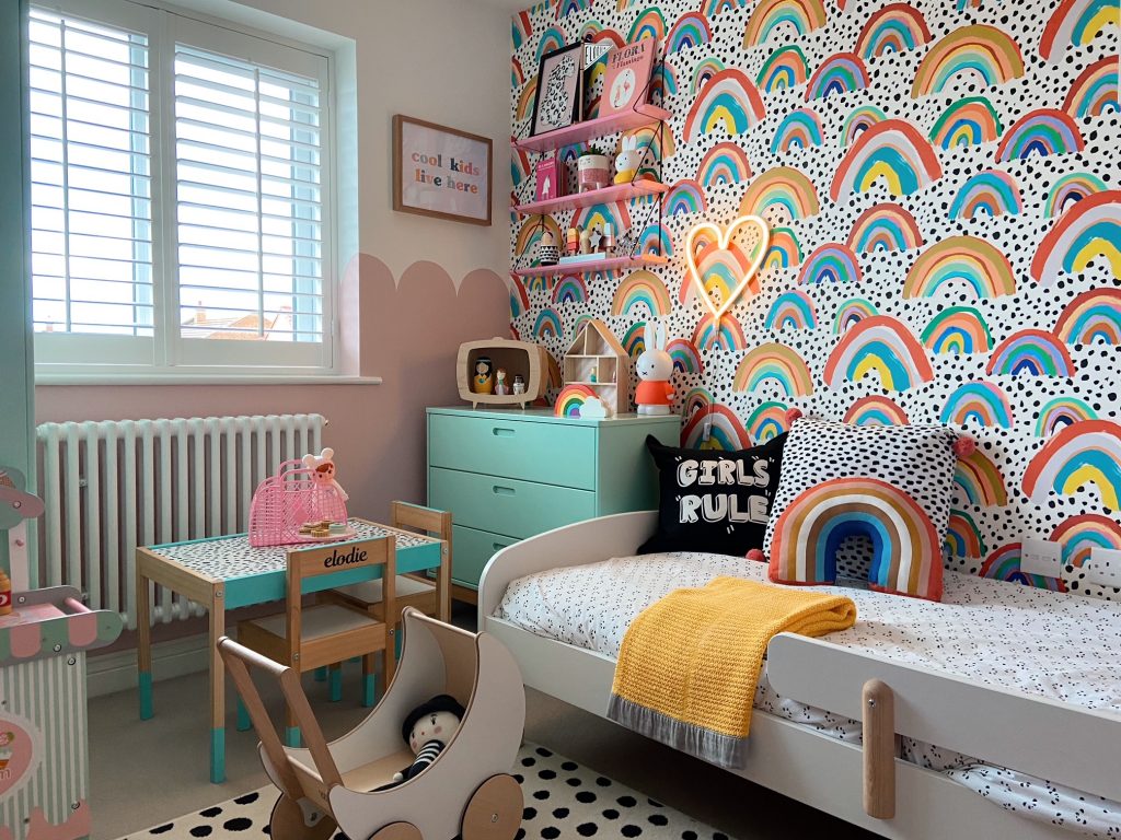
In sharing my home I think it would be silly to not include my favourite rainbow room! This is my daughter’s room and it’s the happiest corner of our house. We wanted to turn her room from a nursery into her dream bedroom, she asked for rainbows, and got rainbows! The fabulous wallpaper is from Eleanor Bowmer whose prints are just absolutely gorgeous and painted the room with pink scallops in Confetti by Little Greene. I like to support small independent stores where I can so I’ve managed to get some great kids homeware over the years. My favourite ones are “The Crashers” for their fabulous cushions, and “Retro kids” for all their bright, fun and colourful kids treasures, like our well-loved heart light. My favourite thing is to come into this room and see my daughter happily playing away in this corner – it’s just a perfect sight and so uplifting!

3. The Ensuite
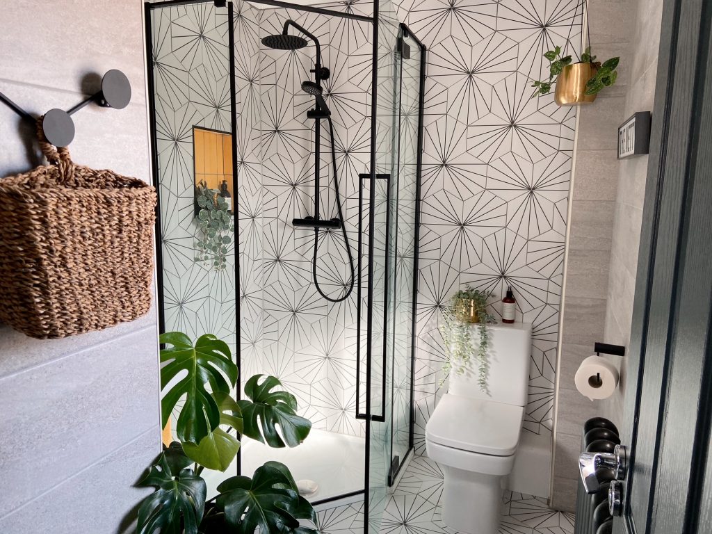
The third corner is our ensuite. We knew we wanted to change our ensuite as it felt very grey and bland but we didn’t have the budget to change everything in the room. So we decided to keep the bathroom suite, except for the shower unit along with a new shower from Drench. We kept some of the existing grey tiles, and decided to change the rest for something bold and bright, and what a difference it has made. It is now the brightest room in our house and a corner that is filled with light when we shower every morning. I love how the black and white tiles (Mandarin Stone) go with our existing grey tiles, but add something fresh and different to the room. And I love our little pop of yellow we decided to add last minute to create a space for our toiletries. This corner for me is one of my favourites as it’s a good reminder to just be brave and go with your gut when it comes to interiors. I was worried this look might be too much, but I’m so happy I trusted my instincts in the end and went for it.

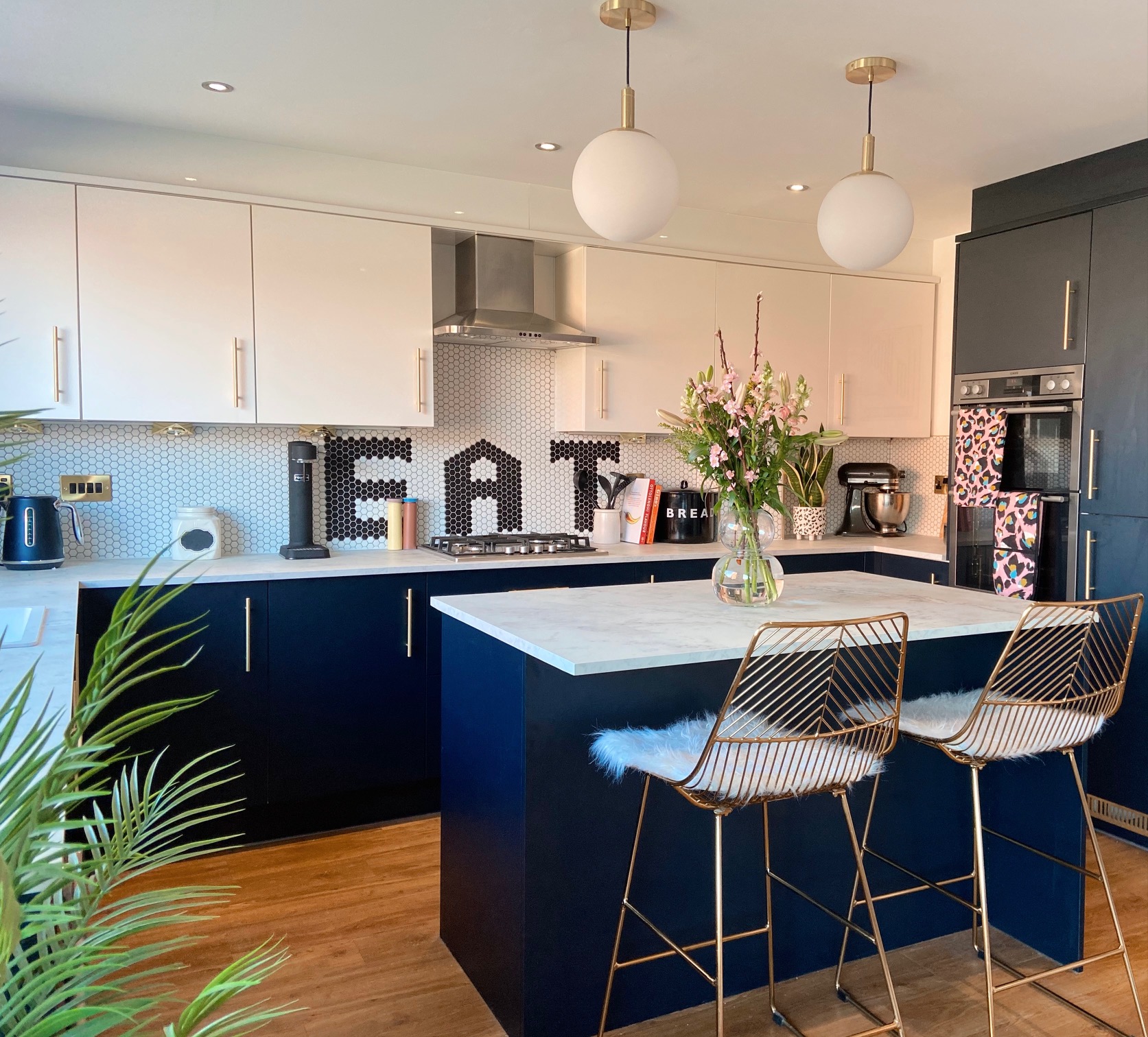
4. The Kitchen


